
PADI Dive Shop Locator
Overview
Goal, motivation, & results
Goal: To improve user experience & engagement, align the website to the overall PADI design, and prepare the Dive Site Locator for upcoming products by redesigning the outdated desktop and mobile views.
Motivation: The original Dive Site Locator, while it "works" for locating dive sites, it needed a revamp to accommodate upcoming products. In addition, the Dive Site Locator was off brand, and needed to align to PADI's overall design aesthetic in addition to improving the overall user experience.
Results: According to the Product Manager, the redesign of the PADI Dive Shop Locator resulted in a 35% increase in overall user engagement and improved sales within the initial week s of the product's redesign launch.
Role, tech stack, & methods
Role: Lead UX/UI Designer
Tech stack: Figma, Adobe Creative Cloud, HTML/CSS/JS
Methods: SWOT analysis, user research & testing, heuristic evaluation, wire-framing, prototyping
What is PADI's Dive Shop Locator?
As the name suggest, PADI's Dive Shop Locator is a tool for would-be divers to locate a dive shop nearby or any user defined location. Dive shops offer courses and/or eLearning materials for students as well as guided dive tours, and conservation activities.
What it used to look like
While it certainly didn't look "that bad", it definitely needs to be modernized for today's age, as well as making the locator more aligned with PADI's visual design style.


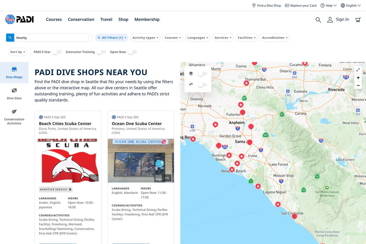
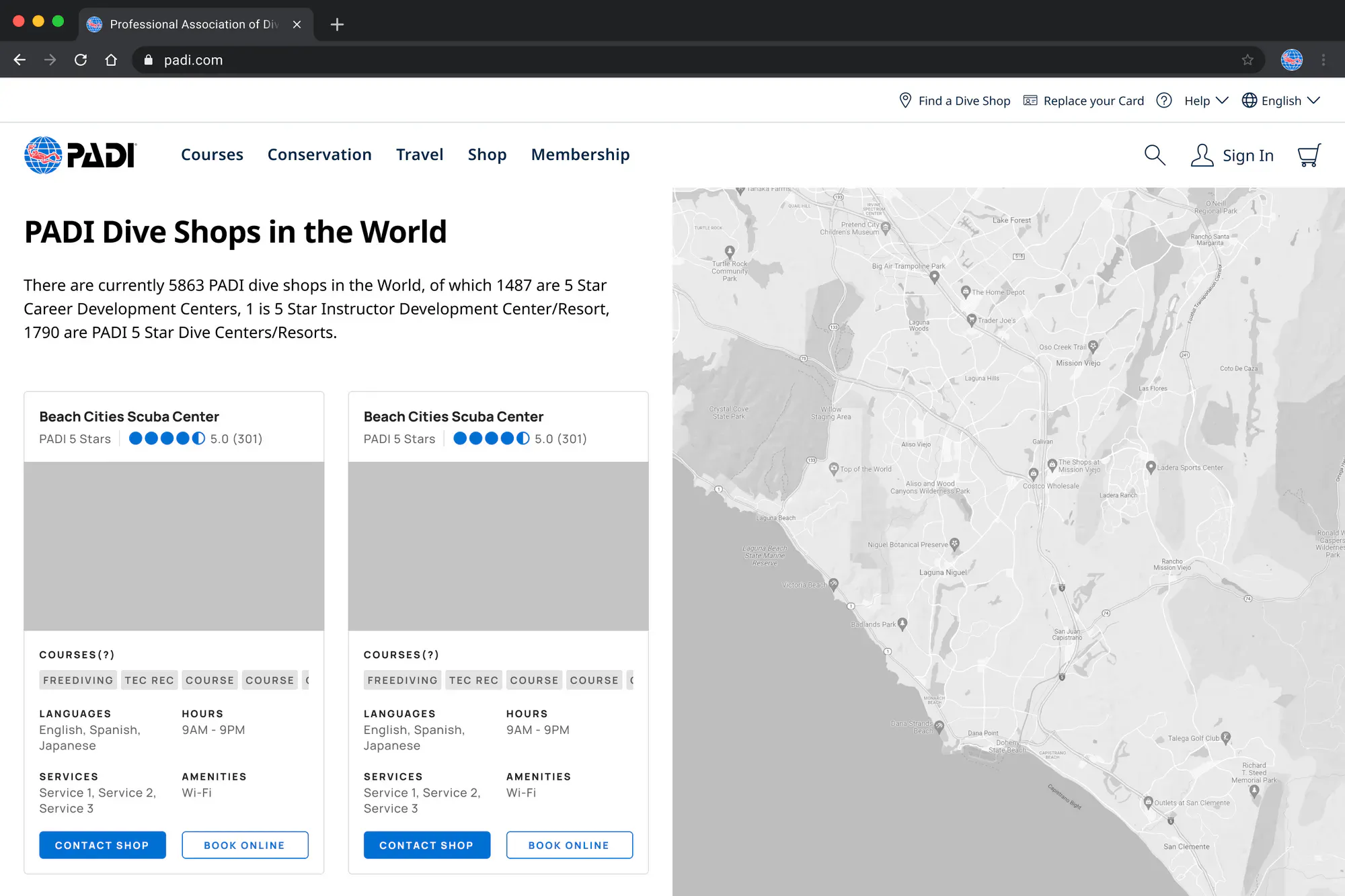
Homepage, Map View, Dive Shop View
As you can see, there is a lot of improvements that can be made on the homepage alone. A simple search bar is pretty useless right now, and it introduces more clicks to achieve the user's goal of finding a dive shop, and reading about what services or courses they offer.
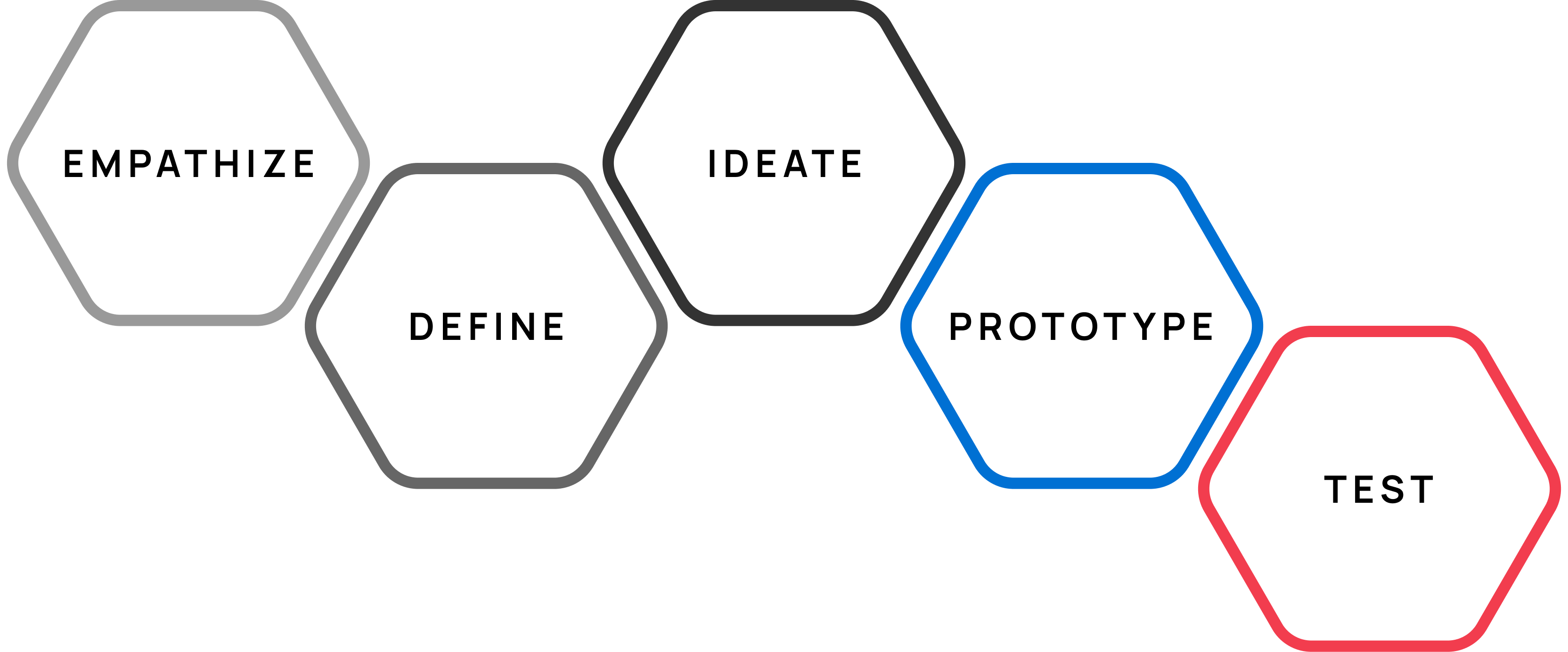
The design process
The design process for this project was in line with the traditional d.School approach to solving a design problem. For this project, I heavily relied on Heuristic Evaluation and used existing recorded user interview sessions. Card Sorting was used as well to organize the menu and filter structure.
SWOT analysis and design inspiration
We heavily relied on SWOT analysis of travel, booking, and real estate websites such as Airbnb, apartments.com, Expedia, Hotels.com, Zillow, and not but least, Google Hotels. We took the strengths of each website we analyzed, but we used Google Hotels as the inspiration and base since the PADI Design System is strongly influenced by Material Design by Google.


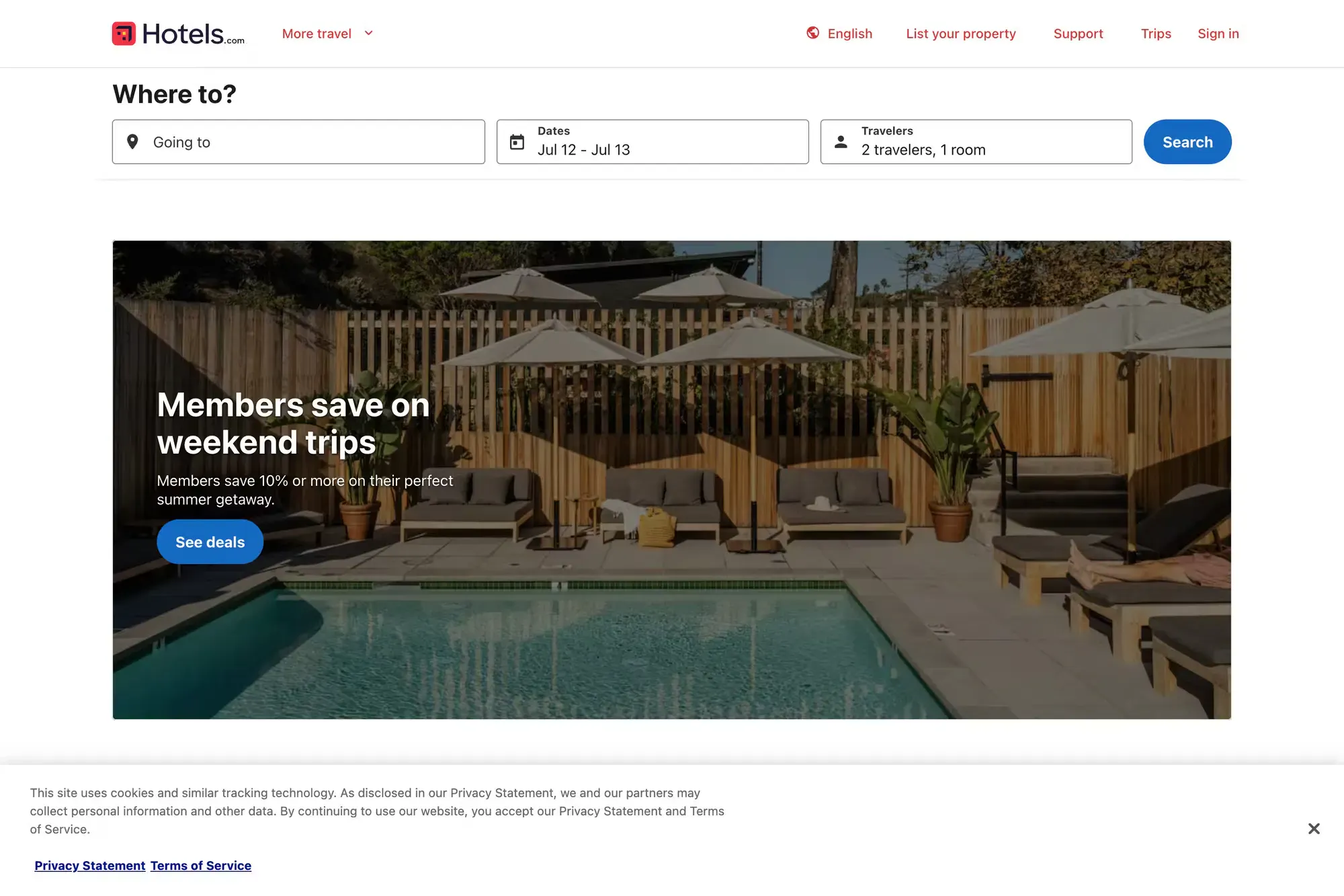
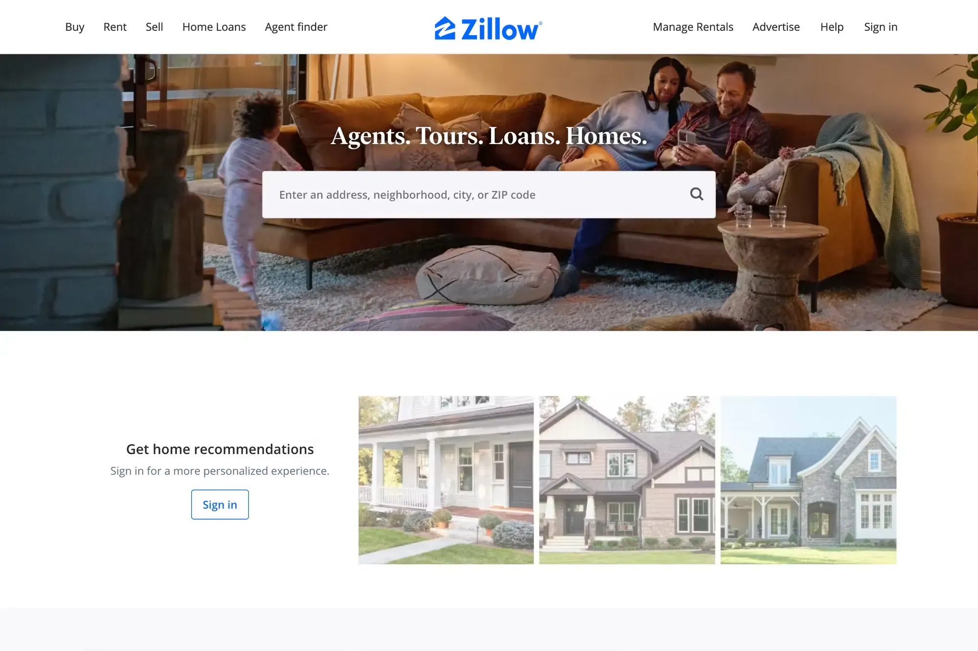

Airbnb, apartments.com, Expedia, Hotels.com, Zillow, and not but least, Google Hotels.
Diving head on
Now that we know which direction the final product would be, I started by creating simple wifeframes and used pre built components to flesh out the initial designs. Some new features may require a new component or so, and I have to create a new component to satisfy the requirements.
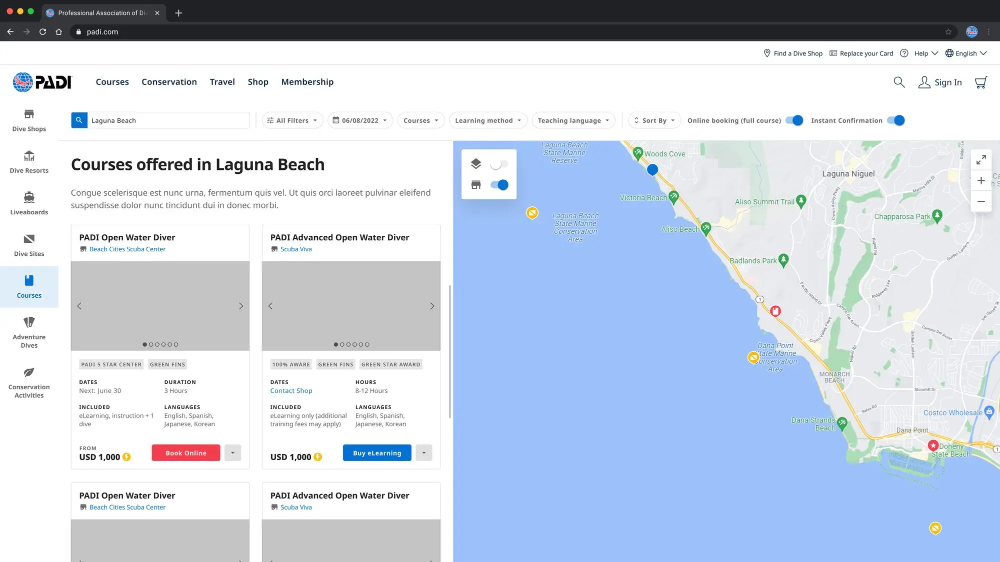
Initial designs


List v1, v2, and Card
Card (phone, tablet, desktop, & large desktop)


Phone, Tablet, Desktop & Large Desktop
Taking a deeper dive
Due to scope creep and time and lack of developer resources, some features that were scheduled for the same release had to moved or cut entirely.

Courses, Liveaboard, Dive Resorts, Featured/Advertised Center, Endorsement
Conclusion
The goal and motivation behind this initiative stemmed from the outdated nature of the original Dive Site Locator, which, although functional for locating dive sites, it needed an overhaul to accommodate forthcoming products. Additionally, the design of the Dive Site Locator was inconsistent with PADI's overall brand aesthetics, necessitating alignment for a more cohesive user experience.
The results of the redesign were highly positive. The Product Manager reported a remarkable 35% increase in overall user engagement and improved sales within the initial weeks following the launch of the redesigned product. This indicates that the project successfully achieved its objectives and delivered tangible benefits to the organization.