Designing Category Pages Under Legacy Bias
Bob’s Watches did not start as a multi-brand luxury marketplace. It started as a Rolex business. That origin still shapes how category pages are designed, prioritized, and evaluated today, often in ways that are invisible unless you look closely at behavior.
Rolex was the original product, the original success story, and the foundation of the company’s credibility. Over time, it became the largest revenue driver and the strongest SEO performer. As the catalog expanded to include other luxury brands, the assumptions that worked for Rolex quietly became the default model for category landing pages across the site, even as audiences and behaviors diverged.
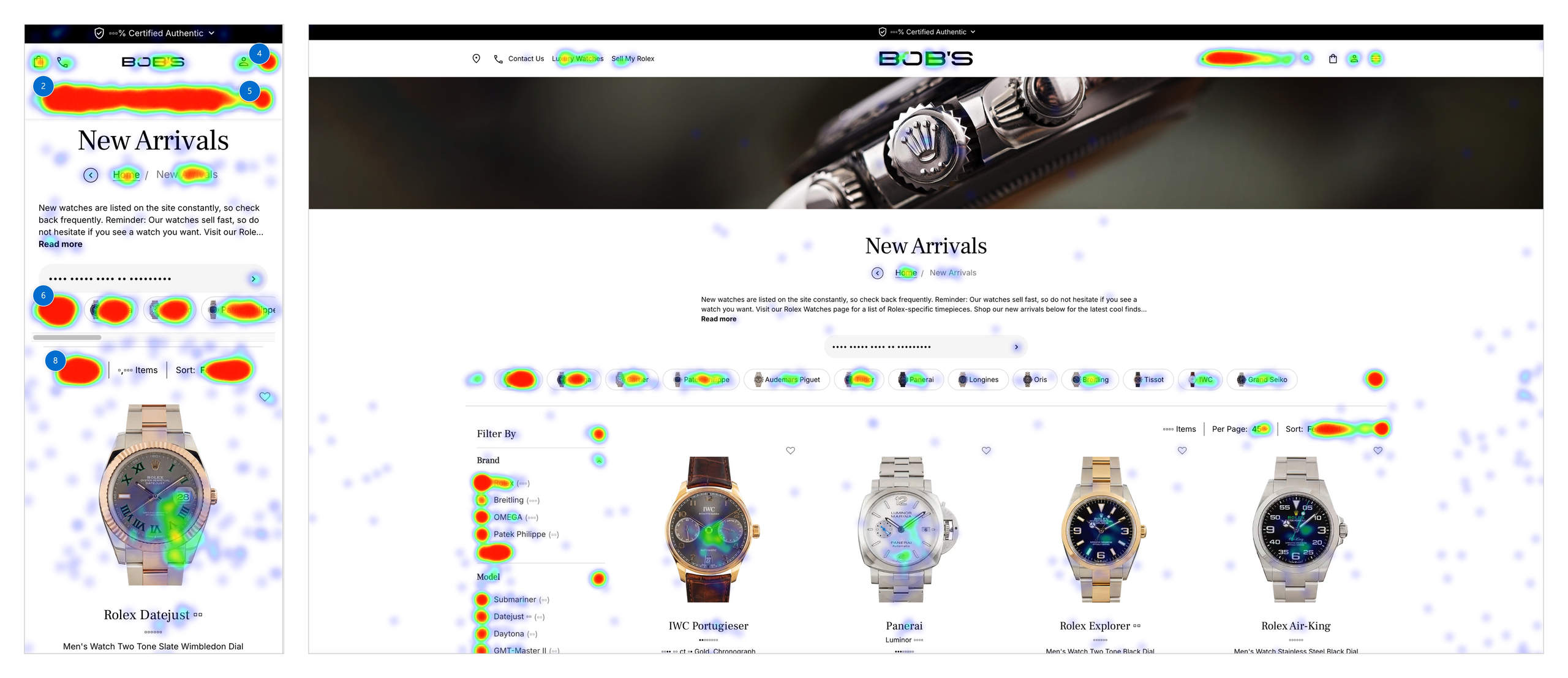
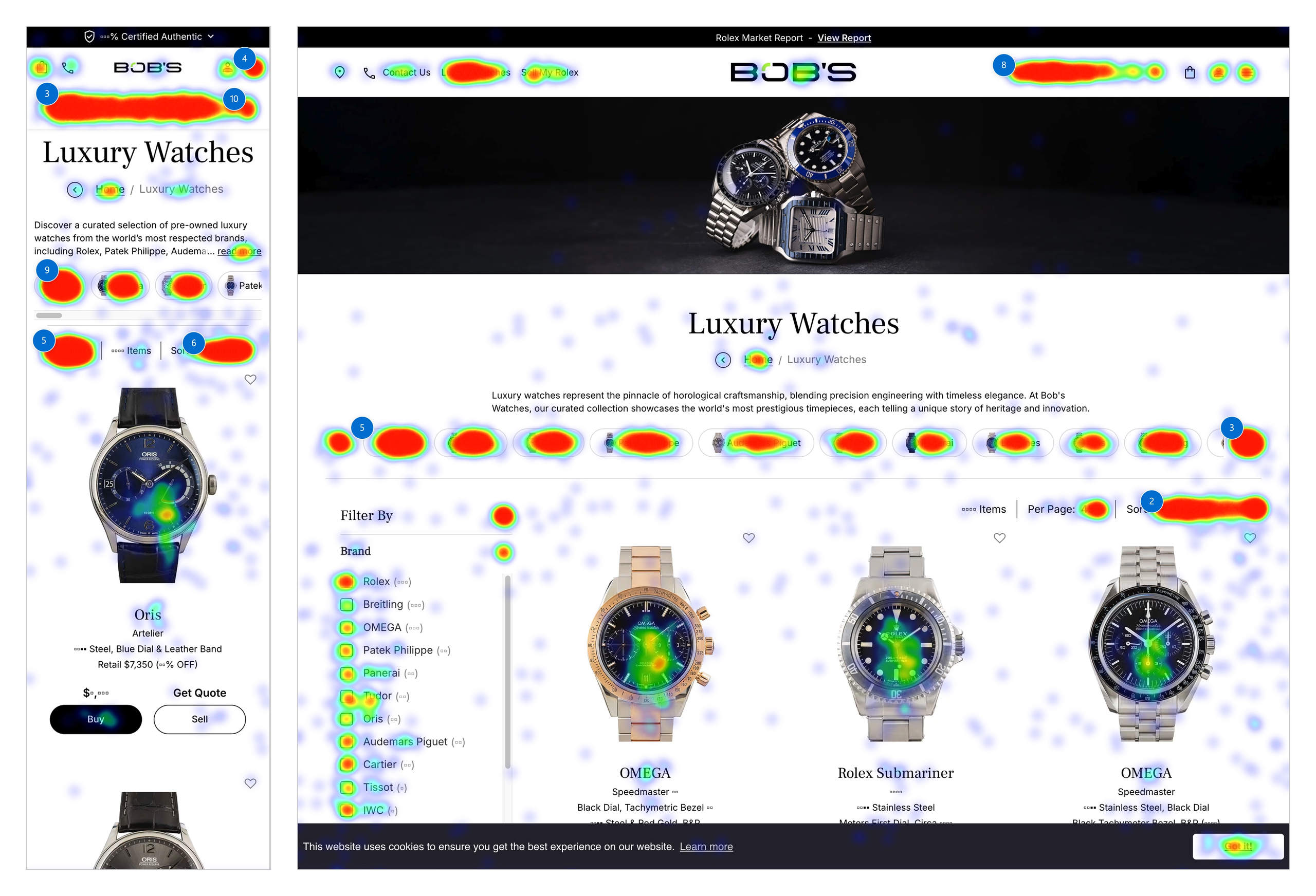
This case study examines category landing pages (CLPs) as a system shaped by that legacy. The Rolex CLP serves as the clearest lens, but the findings are validated by behavioral data across Luxury Watches, New Arrivals, and Omega.
Context
Category landing pages are among the highest-traffic entry points on the site. They attract users from organic search, paid campaigns, and returning collectors who already know what they’re looking for. At the same time, they serve first-time luxury buyers trying to orient themselves in a complex and unfamiliar space.
Over time, these pages accumulated responsibility. They needed to rank for competitive search terms, support continuous SEO copy experimentation, surface large and fluctuating inventories, and act as reusable templates for other brand categories. Each requirement was added incrementally, rarely reconsidering the system as a whole.
None of these goals were unreasonable on their own. Together, they pushed CLPs toward coverage, scalability, and experimentation, often at the expense of clarity and decision support.
On the surface, this looked successful. Engagement was high. Users clicked frequently. Sessions were long. There were few obvious rage signals that would normally trigger concern.
But behavior told a different story.
Research approach and constraints
This work took place in a low UX maturity environment. Formal discovery, usability testing, and iterative validation were not consistently prioritized, and UX decisions were expected to justify themselves quickly against business metrics.
Microsoft Clarity became the primary source of insight. Session recordings, heatmaps, scroll depth, and click behavior were used to observe intent directly, rather than relying on surveys or self-reported feedback that was unlikely to influence prioritization.
The goal was not to redesign CLPs in isolation. It was to identify where user intent was present, repeatable, and blocked, and to surface those breakdowns in a way that could survive organizational and SEO constraints.
What users did across CLPs
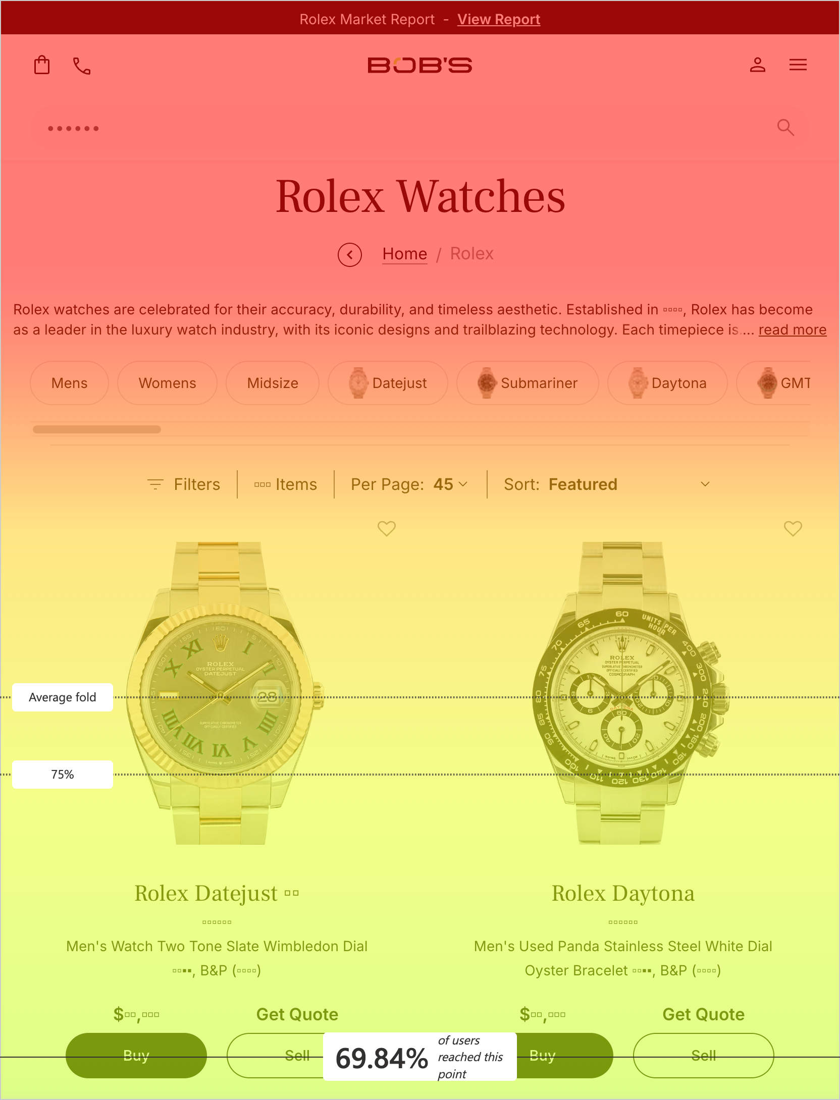
Scroll depth collapsed early
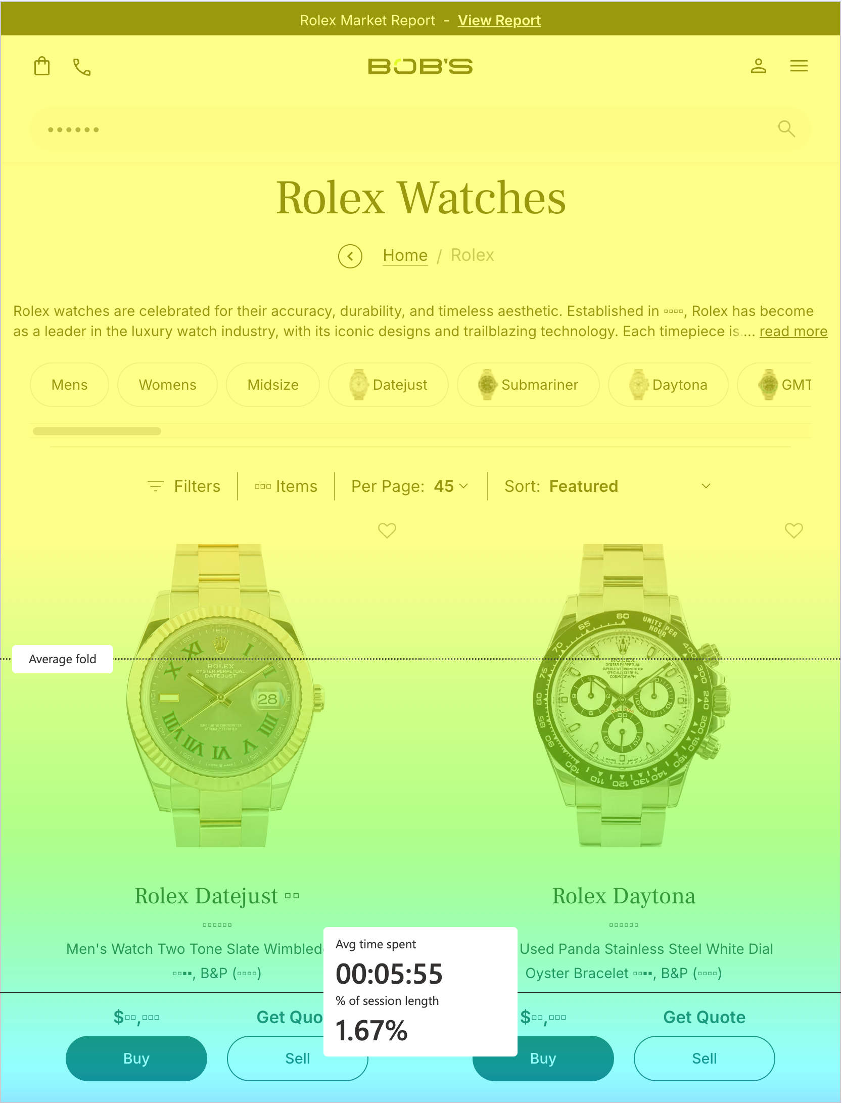
Across Rolex, Luxury Watches, New Arrivals, and Omega CLPs, users spent a disproportionate amount of time within the first few percent of the page. Very few users reached the bottom of long product lists, especially on mobile and tablet where page length increased significantly.
This pattern was consistent regardless of brand or traffic source.

Users were not failing to engage. They were deciding early, then encountering friction before they could act.
Sorting was the clearest signal of intent, and it failed
On the second most viewed CLP, the sorting dropdown was the most clicked element on the page. Users repeatedly switched between “Featured,” “Newest,” and “Oldest,” often within the same session.
The results did not change.
This behavior was one of the clearest expressions of user intent across all research. Users were actively trying to impose order on large inventories and reduce cognitive load. The interface suggested control was available, but failed to deliver meaningful feedback.
Rather than abandoning the page, users retried. Engagement increased, but progress did not.
One-Size-Fits-All Filtering Didn’t Match How Users Browse
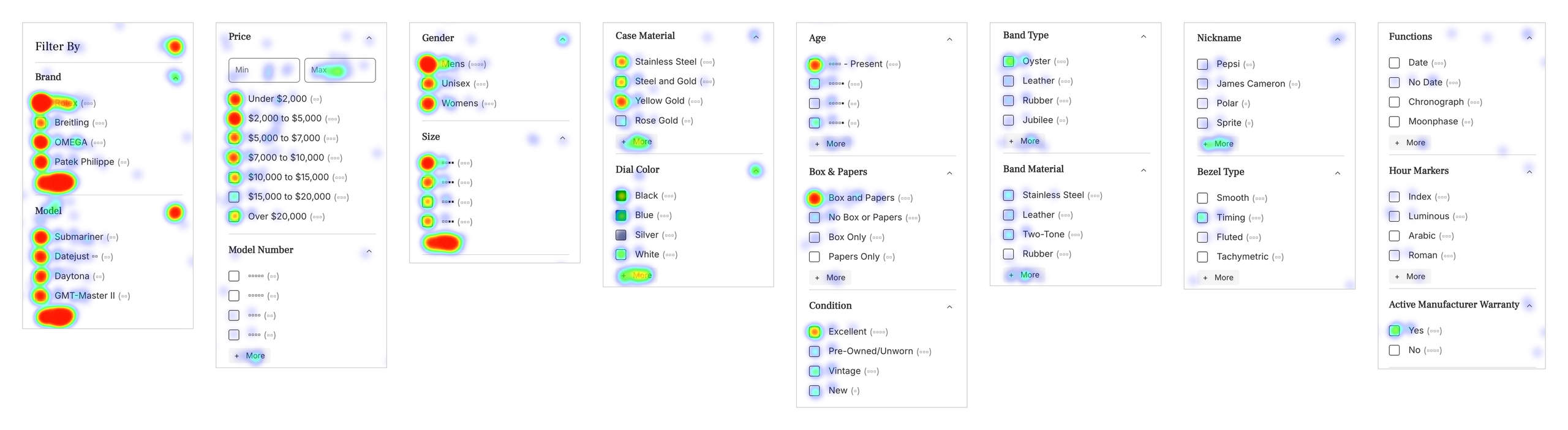
On the New Arrivals CLP, filters were presented in a consistent, standardized order across brands. Heatmap data showed that users concentrated attention on a small set of top-positioned filters, while many others were consistently underutilized, despite being available and relevant for certain models.
This pattern held across brands. Filters that worked well for some collections failed to meaningfully support others, yet the interface treated all dimensions as equally important everywhere. The result was a refinement system optimized for consistency, not for how users actually browse or compare watches.
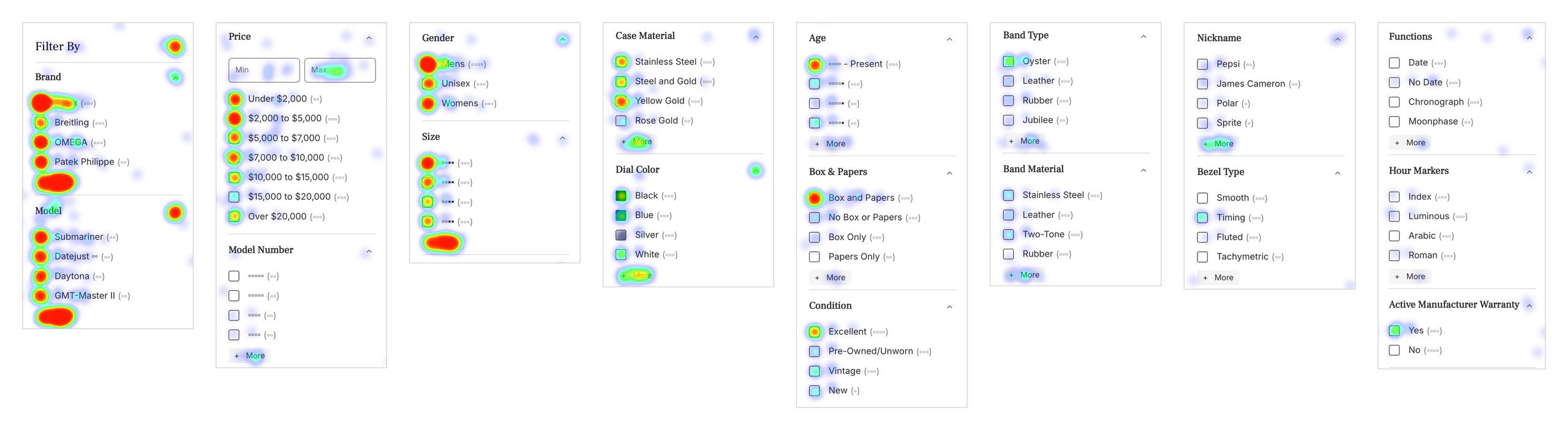
Filter interactions clustered toward the left in a standardized left-to-right hierarchy, leaving later filters underutilized across brands.
Rather than adapting to brand-specific mental models, the filters assumed a single way users would refine results. Clarity data suggested otherwise. Users relied on the most prominent filters, even when those options didn’t meaningfully narrow results for the brand or category they were exploring.
The issue wasn’t filter quantity or functionality. It was the assumption that a single, static filter hierarchy could support fundamentally different browsing behaviors across the catalog.
Navigation Friction Interrupted Momentum
On the Rolex CLP, desktop users heavily clicked “Next” and “+ More,” confirming strong intent to explore beyond the initial set of results. This aligned with Rolex’s broad catalog and high comparison behavior, with users actively scanning beyond what was initially visible rather than browsing passively.
On mobile, Clarity flagged repeated taps around the first model in the slider. In practice, the element was navigable, suggesting the issue was not a true dead end but interaction ambiguity. Users appeared to tap expecting clearer feedback, faster response, or a larger hit target, then retried when the interface failed to acknowledge the action clearly.
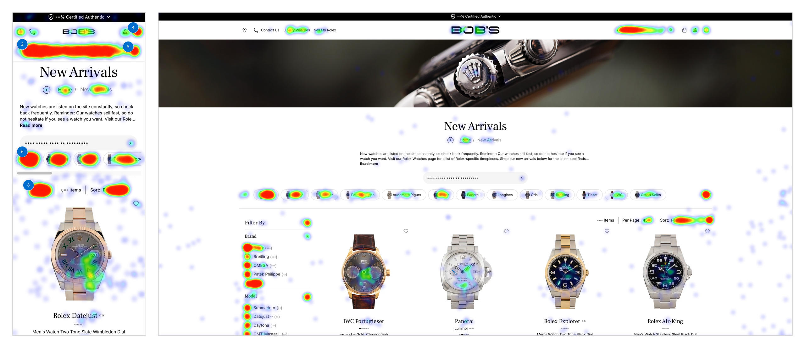
In the New Arrivals CLP, a related pattern emerged. Data showed strong interest in Tudor models, yet within the model slider those watches were not emphasized or surfaced early. Ordering within the slider was driven primarily by SEO priorities rather than observed user demand, forcing users to work harder to locate models they were clearly interested in.
Momentum wasn’t lost gradually. It was interrupted at the moment users tried to go deeper, either by unclear interaction feedback or by content ordering that didn’t reflect real demand.
Aggressive interruptions undermined early intent
Across all major CLPs, the Klaviyo email signup popup consistently surfaced as one of the most interacted-with elements on the page, not because users valued it, but because they were forced to dismiss it before engaging with content.
On mobile and tablet in particular, closing the popup frequently registered as the first interaction, and in many cases, the last. On Rolex and Omega CLPs, dismissing the popup outpaced meaningful product interactions by a wide margin.

The issue wasn’t simply that the popup existed. It was that it appeared at the exact moment users were deciding whether to engage at all. Instead of supporting discovery, it demanded commitment upfront, amplifying friction across already complex pages.
The systemic pattern
Taken individually, these issues could be dismissed as implementation gaps or edge cases. Taken together, they revealed a consistent signal across categories and devices.
Users were actively trying to:
- Control ordering
- Narrow results
- Explore deeper inventories
- Reduce uncertainty before committing
The system repeatedly failed to support those actions.
High engagement was not a sign of success.
It was evidence of users working harder than the interface allowed.
This is where legacy bias mattered most.
Because Rolex continued to drive traffic and revenue, engagement metrics reinforced the belief that CLPs were functioning as intended. The same structures were reused across other brands, even as their audiences behaved differently and required different forms of guidance.
What looked like consistency was actually inertia.
Design response
The following concepts were created as directional redesigns based on observed behavior, rather than as part of a full end-to-end redesign initiative.
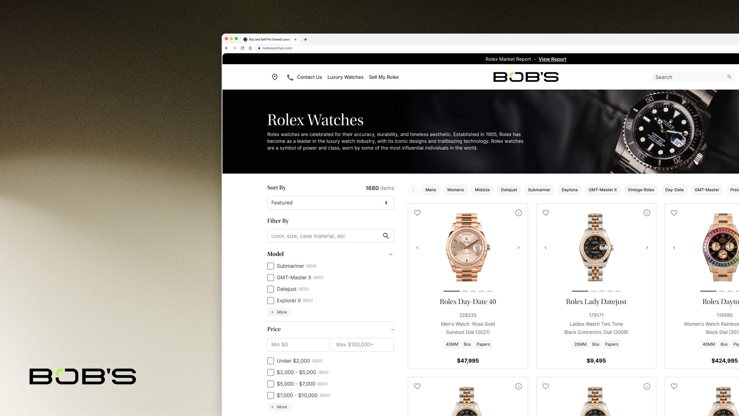
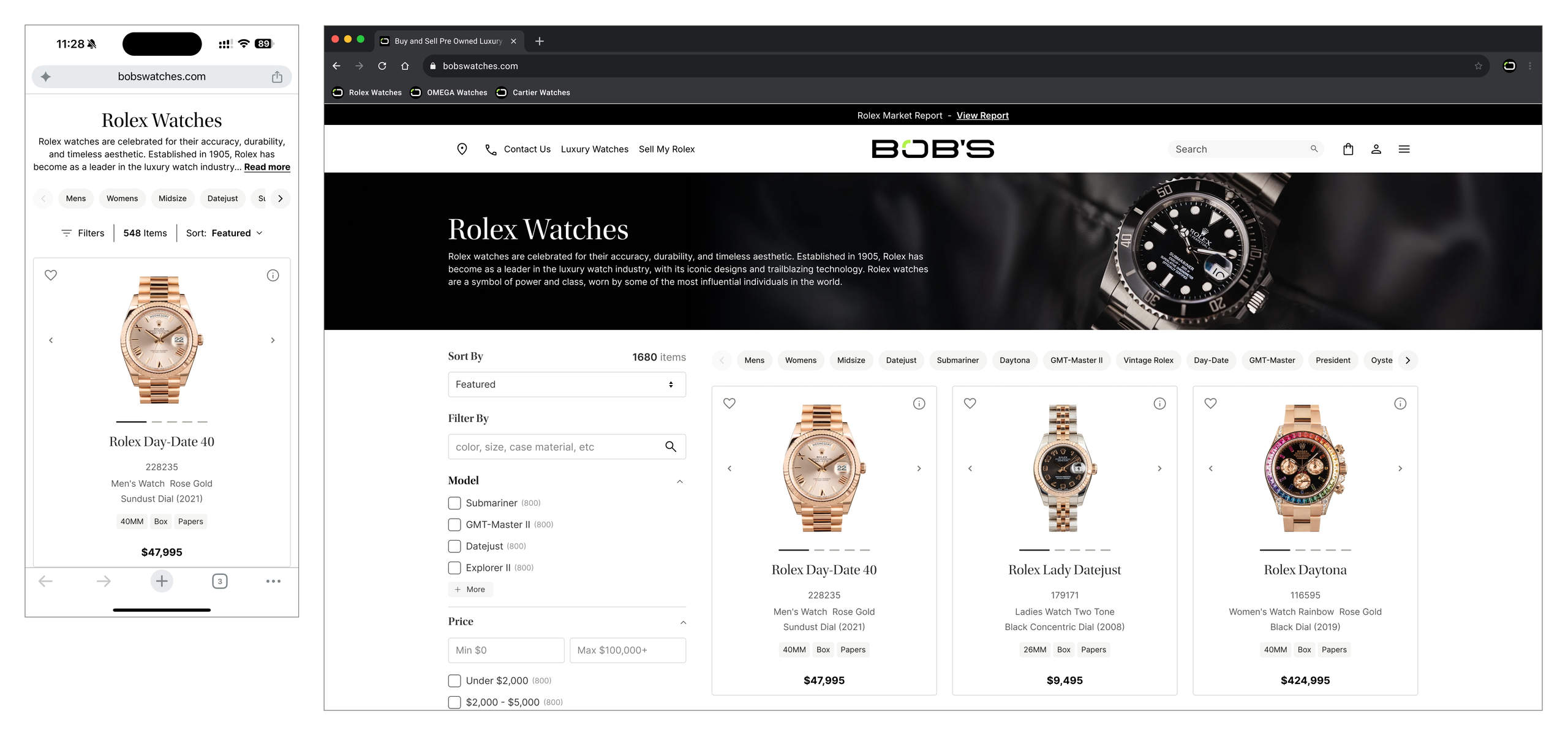
Category landing page concept
The CLP was refined to support early decision-making rather than exhaustive browsing. Vertical space was reallocated to bring products, model navigation, and primary filters above the fold, reducing dependence on deep scrolling and delayed refinement. Sorting and filtering were consolidated into a single control area, aligning page structure with how users compared and narrowed inventory in practice.
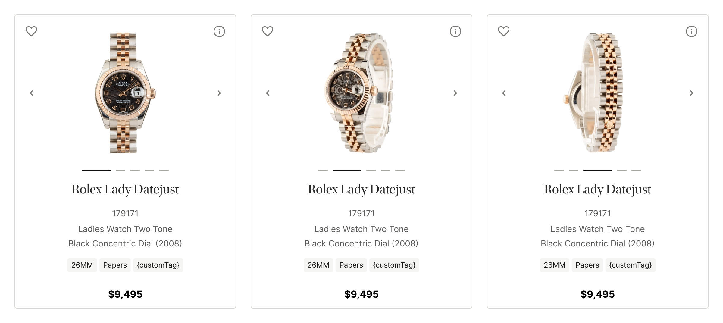
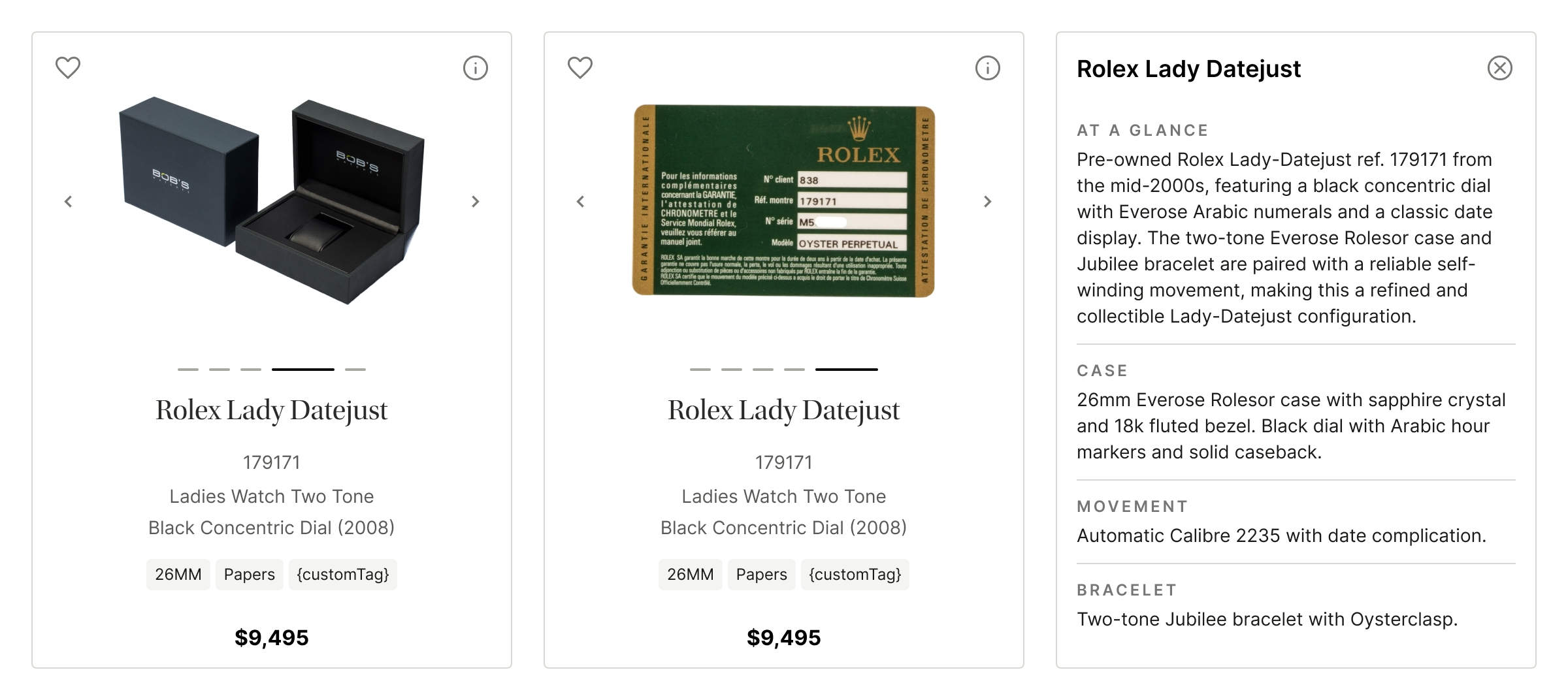
Product Card Concept
Product cards were refined to support comparison and decision-making directly within the listing view, reducing unnecessary navigation to the product detail page. A contextual information (“i”) affordance surfaced important non-SEO details without disrupting the existing title and description structure.
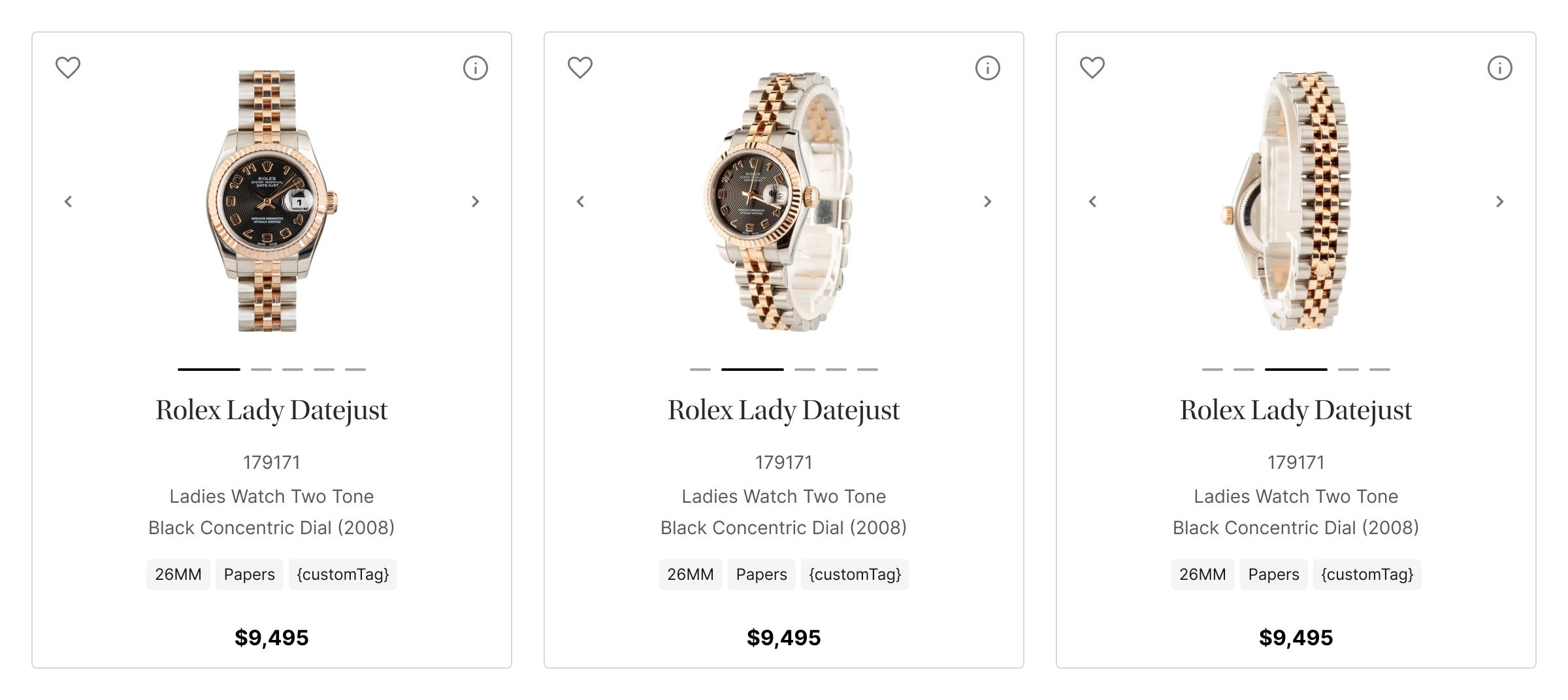
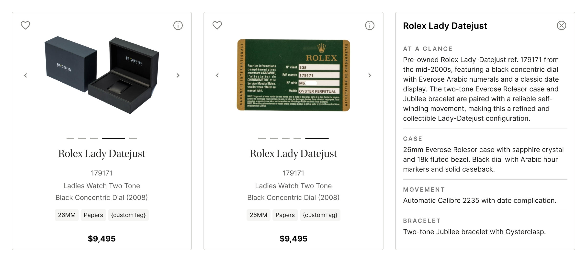
Lightweight tags were added to highlight key differentiators such as size or box and papers, improving scanability while preserving the original text hierarchy. An inline image carousel allowed users to review multiple angles and details without leaving the category page.
The original button layout was preserved to avoid retraining users, but the “Buy” action was redefined. Instead of routing to the PDP, it now initiates checkout directly, aligning the interaction with user intent and addressing observed hesitation in existing click behavior.
Filter Concept
Filters were refined to improve clarity and reduce cognitive overhead by introducing search within the filter set. Rather than forcing users to scan a long, one-size-fits-all list, search allowed users to quickly locate relevant refinements based on their mental model and intent.
This refinement addressed a core issue surfaced in the New Arrivals data: filters were functional but difficult to navigate at scale. Adding search shifted effort from visual scanning to direct retrieval, making refinement faster and more predictable without restructuring the entire filter system.
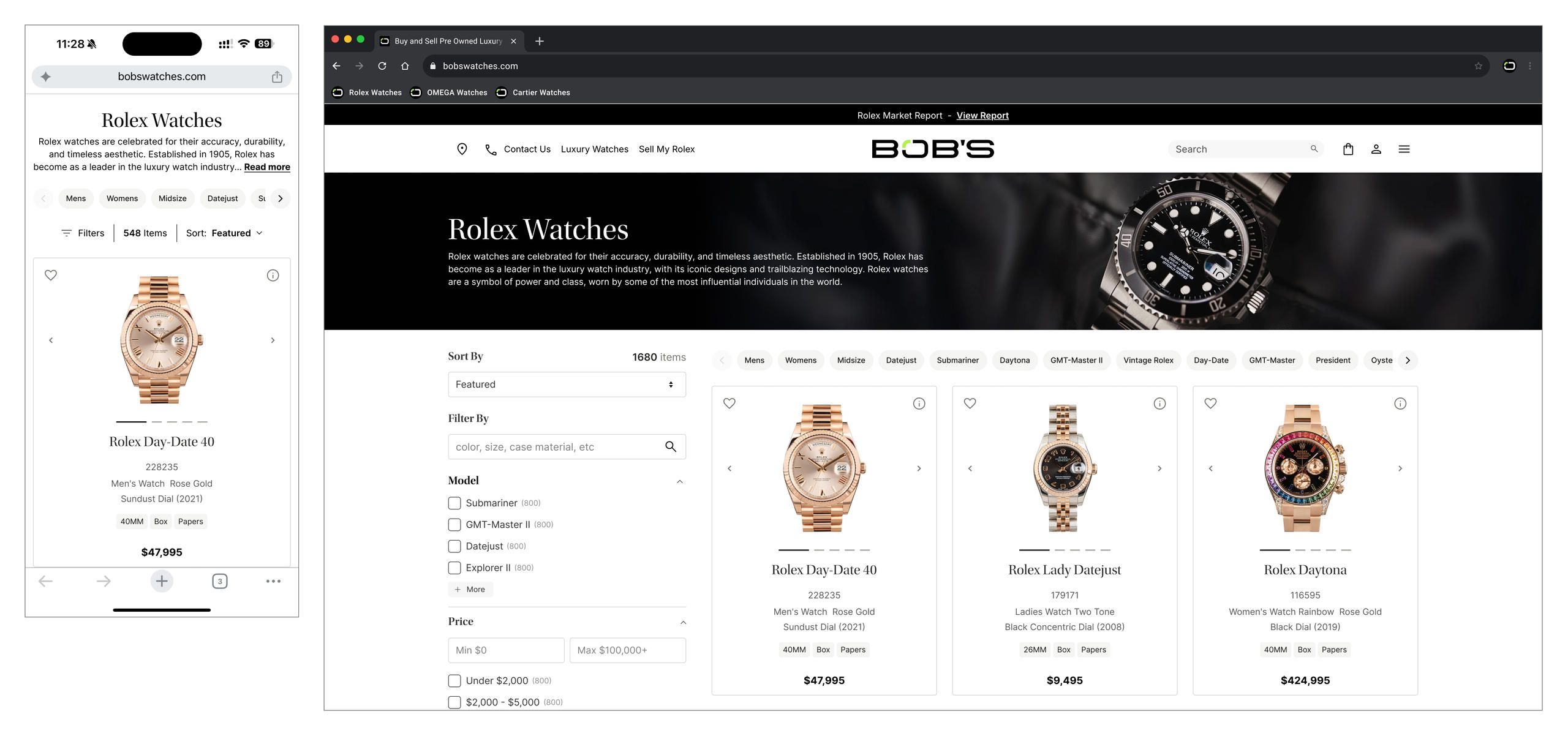
These changes represented a focused, low-disruption improvement aligned with observed behavior, without requiring a full systemic overhaul.
Outcome
This research surfaced systemic UX issues that were previously hidden by strong engagement metrics. It aligned teams around behavioral evidence rather than assumptions and established decision-first principles to guide future CLP improvements under real organizational constraints.
More importantly, it created shared language for discussing hesitation, something that had previously been misinterpreted as healthy engagement.
Reflection
In a higher UX maturity environment, this work might have resulted in a redesigned category framework. In this context, the most meaningful impact was clarity.
Users were not disengaged. They were persistent. They clicked, sorted, paginated, retried, and searched for signals the interface failed to provide. Hesitation wasn’t a lack of interest, it was the cost of unresolved uncertainty.
Designing under legacy bias means recognizing when past success becomes an invisible constraint. Sometimes the most valuable UX work isn’t shipping new interfaces, but making those constraints visible so better decisions can follow.
That visibility became the real deliverable.